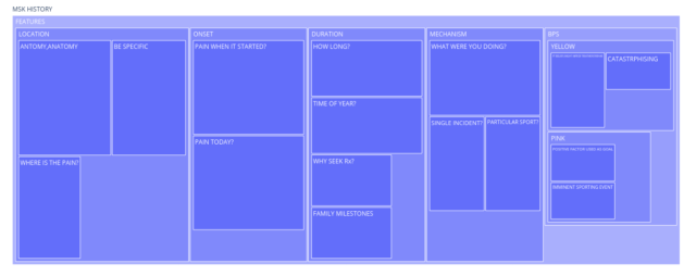
When thinking about an MSK history and what areas need to be covered with your patient you quite quickly realise that there are some key areas, but thereafter multi-layers that sit beneath these areas. For those that prefer visual content, this can be very difficult to depict. Let’s think about the history of charting hierarchical data.
As clinicians, we are used to seeing data presented in algorithmic nature such as flow diagrams, but these ARE NOT hierarchical. Instead, think of a family tree or a mind map. It looks similar but displays the data differently, though they can be messy when they become complex.

One of the first ways of displaying multi-level data was developed by Shneiderman and Johnson in the late 1980’s. Treemaps present an elegant solution to the problem of displaying hierarchical data in computer file systems.
When you open Windows explorer or finder on your computer or Mac you can see a list of files within a folder. Displaying the contents of each folder simply makes the list very long, but it’s just a list. It doesn’t offer any perspective on the relative size of the files using up the storage on the drive.

Treemaps were designed to make more efficient use of the available screen space when viewing the contents of a computer. Instead of showing a file system as a long list of files and directories, files are displayed as rectangles, with the size of the rectangle being proportional to the size of the file. It is then possible to display more information at once if we use all the available space. So in the above example, it easily shows that the activity and pattern sections are proportionally larger than the other areas. Again though, these can be very messy when more complex, for example here when expanding the features section.

The first mention of sunburst charts was in the 90s when researchers experimented with nested pie charts and radial treemaps. They display the same data, but sub-layers branch out radially from within each section

When these are expanded into the sub-layers, they are much more pleasing to the eye and somehow seem much easier to interpret. So I’m going to take my history jigsaw and start to add a third dimension of apportioning size within each sector in terms of importance. This way we will see where the key areas of the history fall out and it will be easier to see areas of greater importance.
Why Use Visuals To Think About Patient Histories
The teaching of history taking is so often delivered through verbal and written means, relying heavily on acronyms such as OLDCARTS, OLDCIPPA in MSK or more generally SOCRATES in medical...
Read MoreThe Concept Of A Clinical History
Previous research has shown that physicians make a diagnosis from the patient’s history in 70-90% of cases. By the medical history, physicians garner 60–80 % of the information that is relevant...
Read MoreArticles
The more I think about the impact of clinical histort taking the more it seems to feed into so many aspects of MSK, podiatry, other specialisms within podiatry and learing on the undergraduate podiatry journey. When I get the inspirations, I’ll add the articles.


